Here we are at the final reveal of the One Room Challenge ! We made it!
This was my first time participating in this challenge... over the past six weeks I've been making over the sweetest little boy's bedroom.
I'm so excited to show you how it turned out!
Let's go back to the beginning and remember where we started from. If you've been following along you know that this bedroom had a lot of good things to begin with (bedding, dresser, lighting) & really just needed something to take it to the next level.
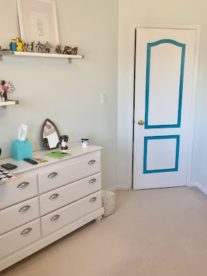
Here's what it used to look like.


It's amazing how little changes made such an impact!
This bedroom is a real lesson in just using what you have and making it all work. I think a lot of people get to this point in their decor and then are not certain what to do with a room. You can see that the layout worked and that the paint and lighting stayed as well. From this point I just took my inspiration from the bedding that my client had. Common themes you'll see throughout the room are black & white, primary colours & toy cars. Typically I stay away from themed rooms but his little boy loves cars and he had the sweetest bedding. I wanted to add something striking on the focal wall but didn't want to compete or take away from the bedding's pattern. The swiss cross decals added a bold statement without being too overpowering...
seemed like the perfect fit & were very easy to put up.
I think every toddler's room needs a teepee ... why didn't they have these when I was growing up? This beautiful striped number (from Walmart) was perfect for the room. This corner needed some height and some black to balance out the room. The toys/stuffed animals I styled on the dresser and bookcase were just toys I pulled from the toy box. Hey if it's cute and works with the colour scheme, why hide it in a toy box? I also used some art that my client had and some that my toddler client made, to style the dresser.
This black IKEA lamp was perfect for the dresser, and added the height that was needed just under the shelf.
These classic car prints from Moriland above the bed were just the perfect addition to this bedroom. You can see that they are simliar in style & colour to the bedding but not exactly the same.
Here's my sweet little client, Nolan, who actually helped his mom with the final decals... I told you they were easy.
And for all those moms out there wondering if kids play in teepees... this little guy does!
Hoping to do another room in the fall with the next ORC.
And a big thank you to my friend, Diana at Shindig Sweets for trusting me to makeover this bedroom for her little boy,
and for providing lots of coffee & yummy cupcakes & cookies!!!
And a big thank you to my friend, Diana at Shindig Sweets for trusting me to makeover this bedroom for her little boy,
and for providing lots of coffee & yummy cupcakes & cookies!!!
You can see my other weeks below:
Be sure to check out the featured designers here & the other guest participants here.
Feel free to connect:
Instagram / Pinterest
Feel free to connect:
Instagram / Pinterest
S O U R C E S
Grey Euro Pillows, Black & White (Wide Striped) Pillows,
Striped Throw, Pom Pom Blanket & Lamp
IKEA
* * *
Pom Poms & Banner
MICHAELS
* * *
* * *
Teepee
WALMART
THRIFTED
* * *
* * *
Chevron Rug & Swiss Cross Baskets
HOMESENSE
* * *
Basket
TARGET
* * *


No comments:
Post a Comment