RE Agent Photo
So here is the little finished kitchen
from the flip... which I think you will agree is quite a bit different than before (see below). As you can tell, there isn't a lot of room in this space. To complicate matters, one wall had a large window and an entrance, another wall had an entrance & a third wall had a built-in. The wall space was roughly 10ft x 7ft, and we had to accommodate a fridge, stove & dishwasher... not an easy space to design. To do this, we had to go with a small dishwasher & fridge... we also bumped the wall back into the bonus room to accommodate the fridge. I went with a modern farmhouse theme in this kitchen with classic white Shaker cabinets (to appeal to most buyers), bamboo counter tops, a farmhouse sink & kept hardware & fixtures black.
Construction & cabinet making for this home were all done by MVH Custom Carpentry.

We all know that eat-in kitchens are a big plus when you are selling and since the window looks out onto the garage & walkway, we extended the counter over the window. This allows for extra seating and also (believe it or not) makes the space feel bigger. I can't take credit for this idea...I saw this on Fixer Upper with Joanna Gaines ... brilliant idea! Another thing I did to make the space feel larger was put a very small white dishwasher in the kitchen. With all the cupboards being white the dishwasher just blends in now and doesn't stand out. If I had put a stainless steel dishwasher here, the eye would have been drawn to it.


RE Agent Photo


This little space off the back of the house... the bonus room... was an add on to the original house by the previous owner. It needed quite a bit of work.. the door was moved to accommodate the fridge and allow better access to outside. Also, one window was removed and an electric fireplace was put in. To elevate this space and make it appear more current, I decided to add shiplap (painted in Simply White by Ben Moore). This really changed the space and not only gave it an updated look, but the horizontal lines of the shiplap made it appear larger.

RE Agent Photo
Because this room is off the kitchen I wanted it to feel like an extension of the kitchen. I kept the floors the same in both rooms and put an eating area in one corner. I also staged the other half of the room, which leads outside, as a mudroom to make this small room multi-functional. Multi-functional rooms are a must in small spaces. The new owners can add hooks and a bench if they want to make it more permanent. In keeping with the modern farmhouse theme, I chose an industrial light from Lowes and a barn door.

Because this room is off the kitchen I wanted it to feel like an extension of the kitchen. I kept the floors the same in both rooms and put an eating area in one corner. I also staged the other half of the room, which leads outside, as a mudroom to make this small room multi-functional. Multi-functional rooms are a must in small spaces. The new owners can add hooks and a bench if they want to make it more permanent. In keeping with the modern farmhouse theme, I chose an industrial light from Lowes and a barn door.


(All photos are mine taken with my iPhone except where noted).
More photos of the main floor bathroom coming soon!
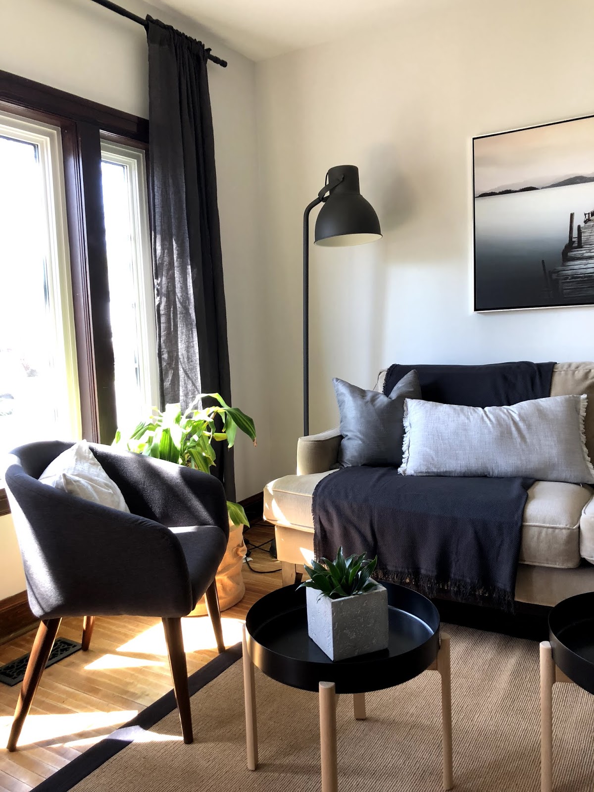
If you missed the living room & main floor bedrooms you can see them here.
Main floor bathroom reveal is up next!